Robyn Uppercase Logo in White

Luminous Face Yoga

Services: Brand Strategy | Brand Design + Development | Packaging Design | Marketing & Social Media Design

Working with the founders of Luminous Face Yoga, Philippa and Camilla, we crafted a playful and energetic brand that championed the supportive face yoga wellness community they’ve carefully crafted over the years.

Face yoga logo in circle
Luminous Face Yoga primary logo
Advertising design for Luminous
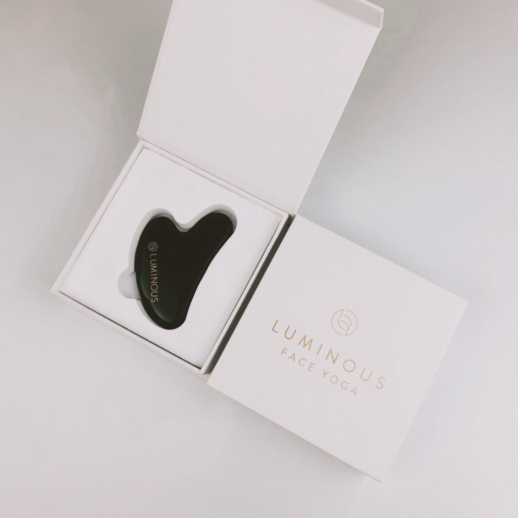
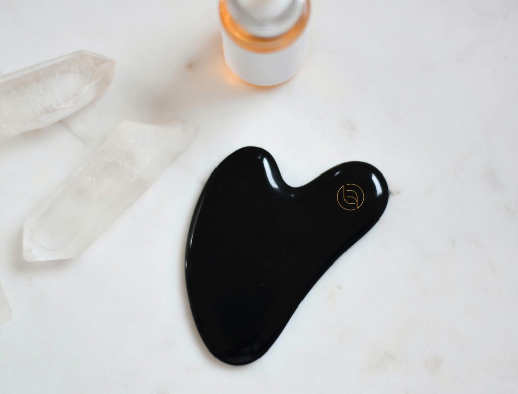
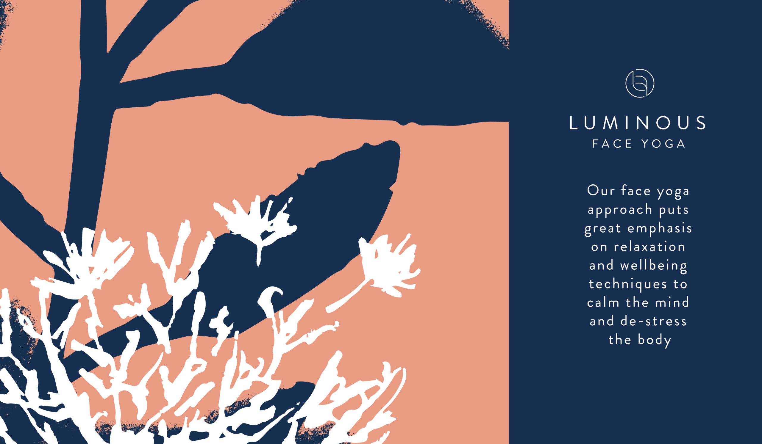
A NATURAL WAY TO LOOK & FEEL GOOD.

Luminous Face Yoga launched in 2020 with the vision to create a one-stop platform where people could access the benefits of facial yoga (for both physical and mental health benefits), without having any previous experience or training.

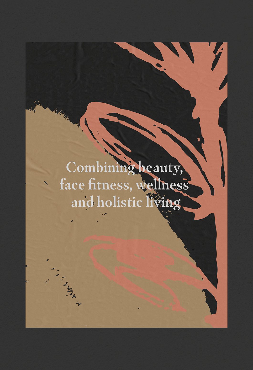
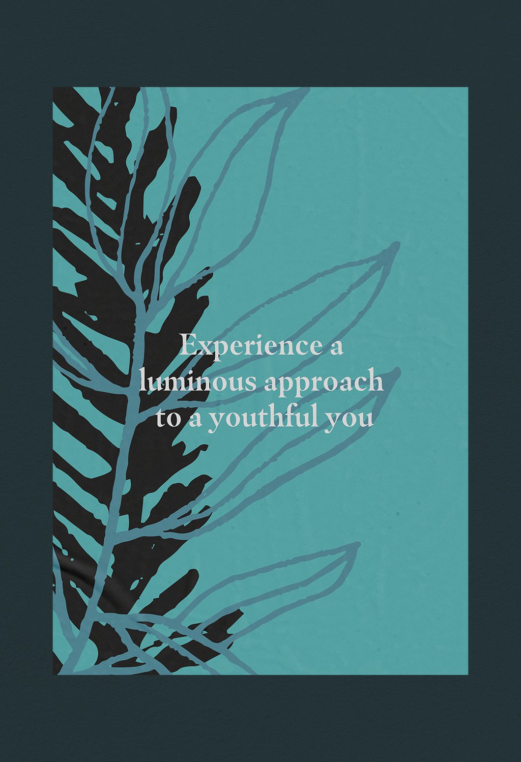
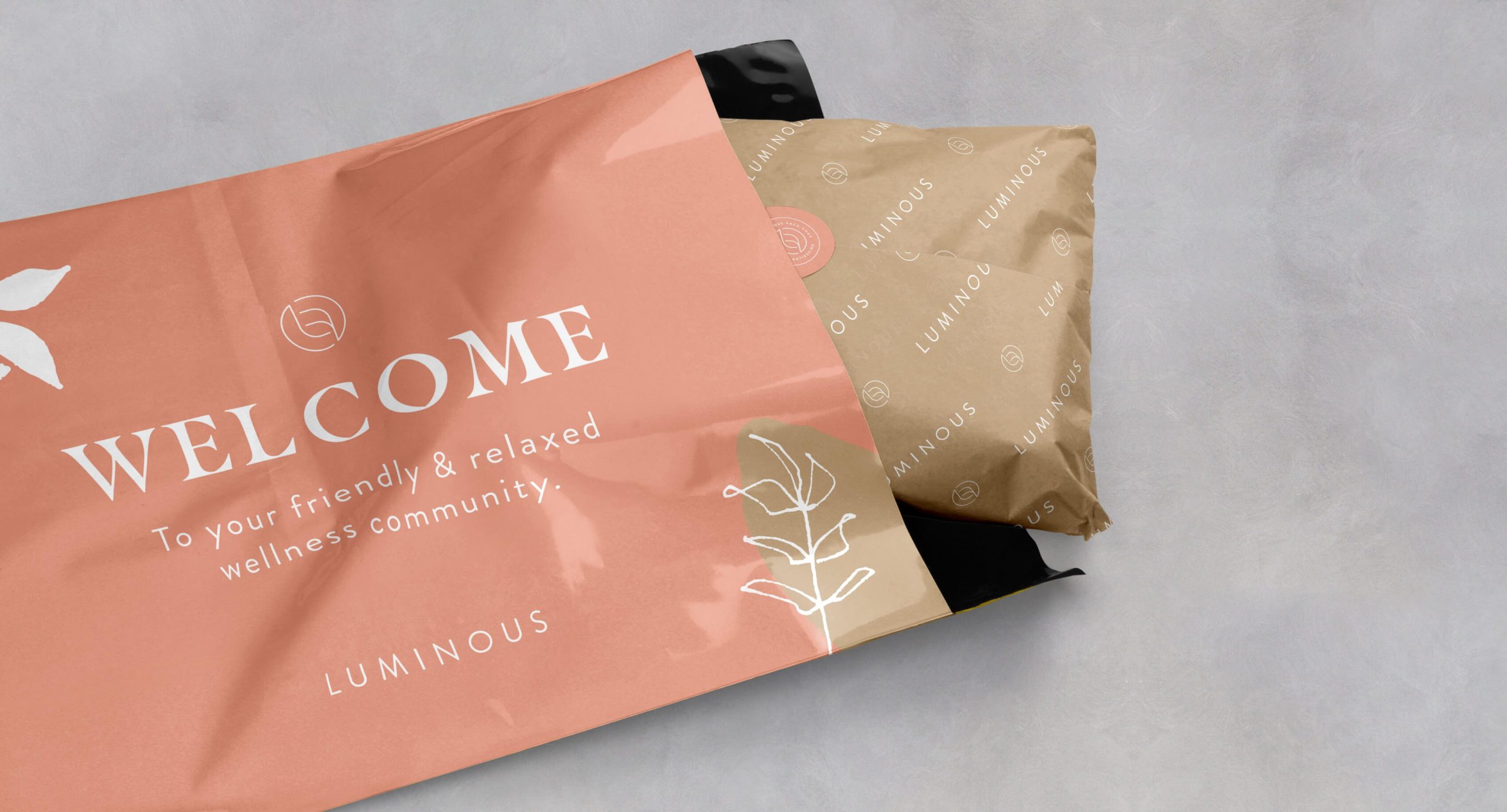
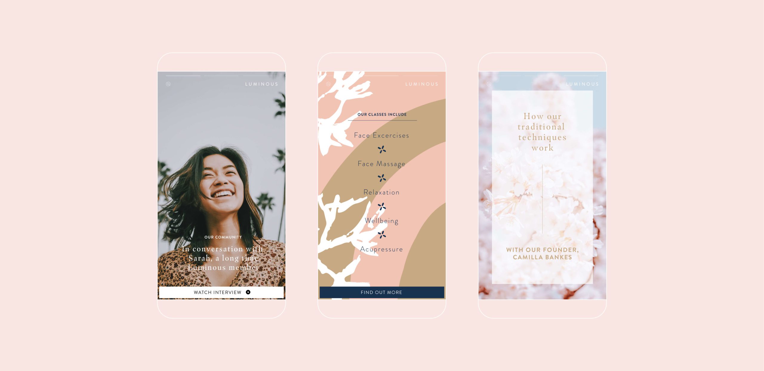
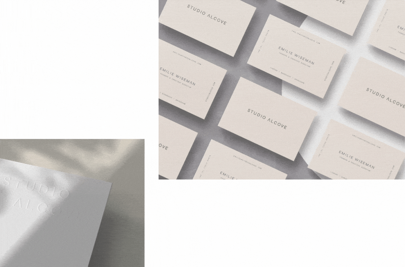
They wanted it to be simple, playful and inclusive. When they approached us they had a very clear problem; their existing brand felt flat, uninspiring and difficult to use. It quickly became apparent that we needed to reframe the brand, and help build a cohesive narrative to relaunch the identity into the market. Working with the team we created a new identity that was expressive and engaging, enabling them to connect with users of all ages and backgrounds. We worked to craft a new tone of voice, and key messaging points and built an adaptable brand strategy that would support them and their consumers. 


Our strategy was to create an identity that was flexible and adaptable, giving Luminous Face Yoga the freedom to express themselves in different ways; whether through print, online or social media. 

Luminous Face Yoga Advertising poster 1
Luminous Face Yoga Advertising poster 2
Branded Welcome packaging envelope with Lumious products including face roller and gua sha tool

The versatile design of the Luminous brand reflected the way their face yoga classes adapt to the needs of and work toward the wellbeing of, all of their members.

The identity was designed to reflect the beauty and simplicity of a naturally holistic brand. The logotype was formed from the L + F in the brand name, creating an intriguing symbol that could be used as a seal of quality across all marketing collateral. Choosing a unique mark allowed for flexibility when applied across marketing materials, being able to communicate the same message but with a unique touch that reflected the quality of service offered by Luminous Face Yoga.

We then coupled this with bold hand-drawn graphic patterns, and layered these with the expressive and contrasting colour palette to give the identity an energetic and playful feel, and retain a personable and inviting persona.

This flexible style was then rolled out across a range of key touch points including packaging, print and social media templates to create a unified brand that was engaging and fresh for its users. 

Credits: Website built and designed by Kappow

Brand photography for luminous Face yoga
Luminous Face Yoga Primary logo
Brand Photography for Luminous
Brand packaging for Face yoga identity
A black Gua Sha tool with the brand mark etched into it
Social media templates for brand identity
Social media template design

Next Project:

Vysana
Luxury business cards for Vysana
Studio Alcove
Cover image for the brand, design and website work for Studio Alcove

Next Project:

Have a project you'd like to talk about?